Interaction design and testing
I mapped player flows and screen structures, built interactive prototypes, tested them with users and revised the designs based on their feedback.
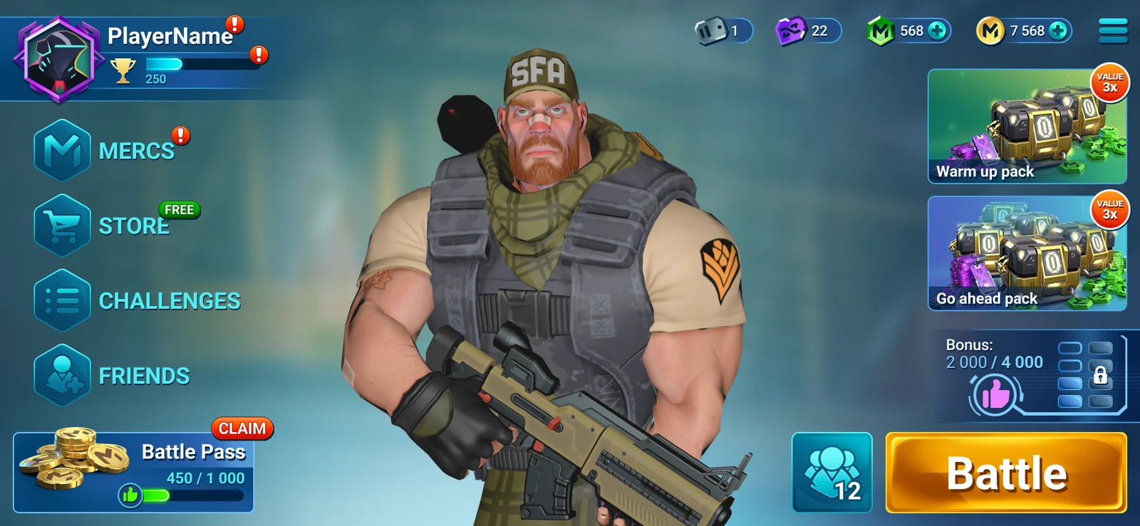
MERX is a mobile hero shooter. I started with an informal review, mapped the game screen by screen and proposed fixes. After joining the team, I worked on player flows, prototypes and the component library through to release.
The starting point / UX audit
The original brief was simply to take a look at the game. I turned that into a structured review: the full screen inventory, the paths between screens and a set of proposed improvements.
I took screenshots of every screen to establish the full scope of the interface.
In Miro, I grouped the screens into branches and scenarios so each issue had context.
I annotated almost every screen with the issues I found and suggestions for addressing them.
I was invited to interview for a full-time role on the MERX team.
The player experience reaches beyond combat: character selection, friends, groups, rewards and navigation all need to work together. My work focused on those connected flows as the game evolved.
Turn separate screens and features into coherent player journeys, while keeping the art team and developers aligned on interactions, components and interface states.
I mapped player flows and screen structures, built interactive prototypes, tested them with users and revised the designs based on their feedback.
I moved layouts from Photoshop into Figma, organized reusable components and maintained the UI kit and documentation, including localization-related code elements.
I reviewed the art team’s layouts from a UX perspective, coordinated designers and checked screens in game builds. I stayed involved as features moved from concept to release.
The character grid and detail view are shown in a wide layout, with safe-area adjustments, and at 1400 × 1050. The layouts show how proportions and positioning change while selection and the upgrade action remain available.
The specification brings together icon sizes and names, typography settings and component states. It records the details the team needs when bringing the designs into the game.
Closed and expanded menus are shown across screen formats. The specifications below cover dimensions, longer labels, and active, pressed and disabled button states.
MERX was released on iOS and Android. My work supported delivery with a shared Figma library, component documentation and design reviews of the game builds.
I owned UX work, prototypes, component organization and implementation reviews. The art team created the visual style, characters and illustrations.
Original designs in FigmaRoles and collaborations
Get in touch about a product design role or a project. My experience spans game interfaces, financial services and mobile products.